Overview
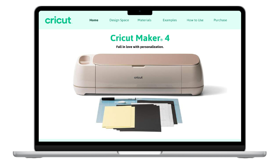
For my User Interface Design II class, I was instructed to create a promotional website or app prototype for a product of our choosing, and teach the user more about it. The main requirements for this project were to incorporate user interface design laws and principles, and make the prototype design easy and intuitive so that it makes the information on the pages memorable.
Laws and Principles Include:
☻ Jakob’s Law
☻ Multimedia Principle
☻ Zeigarnik Effect
☻ Signaling Principle
☻ Teslers Law
☻ Spatial Contiguity Principle
☻Understandable
Project Goals
My goals for this project were to create an interactive website interface that taught users about the Cricut Maker 4 while having an intuitive and smooth navigation experience. I wanted to present the content in a way that was easy for users to understand and memorize information. With designing my promotional page, I followed the colors of the Cricut brand, and took into consideration the various laws and principles of user interface design that we learned in my User Interface Design II class.
☻Interactive
☻Memorable
Process
Project Proposal
The Multimedia Principle
☻Insightful
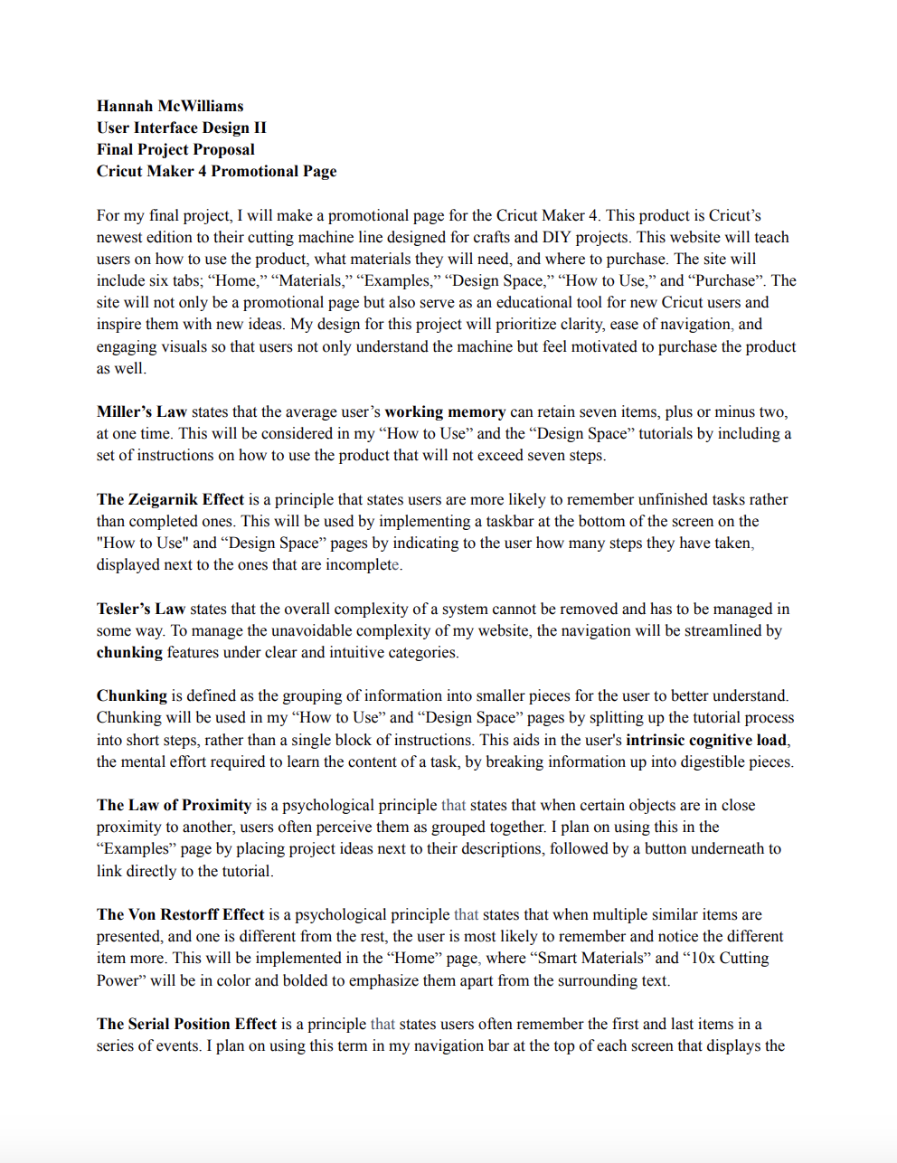
In the beginning of the creation process, I was instructed to make a project proposal that described how I plan to use the various laws and principles of user interface design in my final project. By clicking the image or button below, you are able to view my final project proposal and learn how I planned to use each principle in more detail.
User Interface Design Principles
Zeigarnik Effect
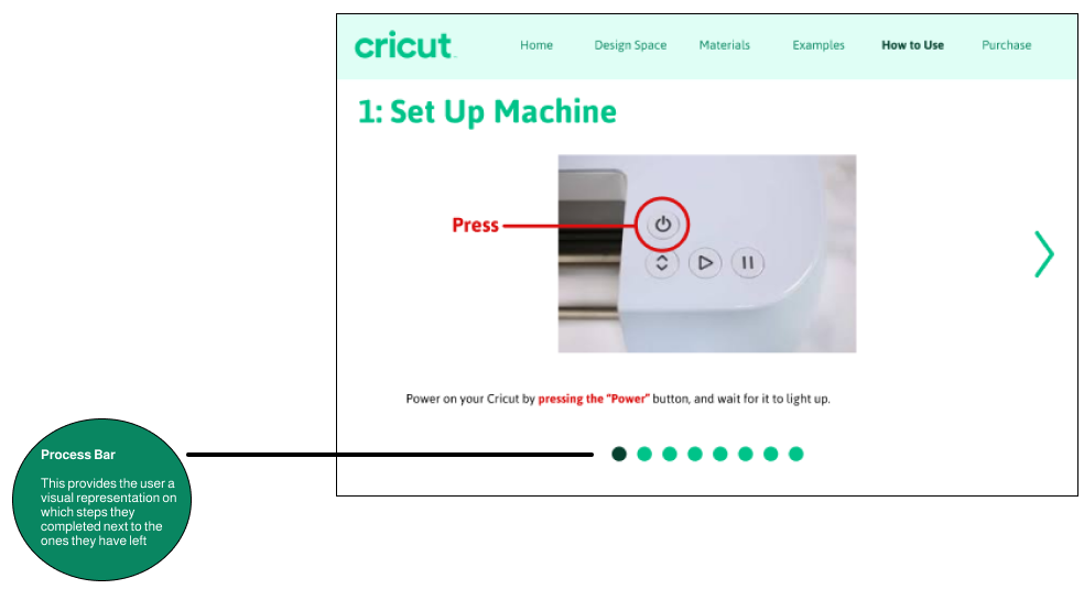
The Zeigarnik Effect is a principle that states users are more likely to remember unfinished tasks rather than completed ones. This is considered in my design by implementing a taskbar at the bottom of the screen on the "How to Use" and “Design Space” tutorials by indicating to the user how many steps they have taken, displayed next to the ones that are incomplete.
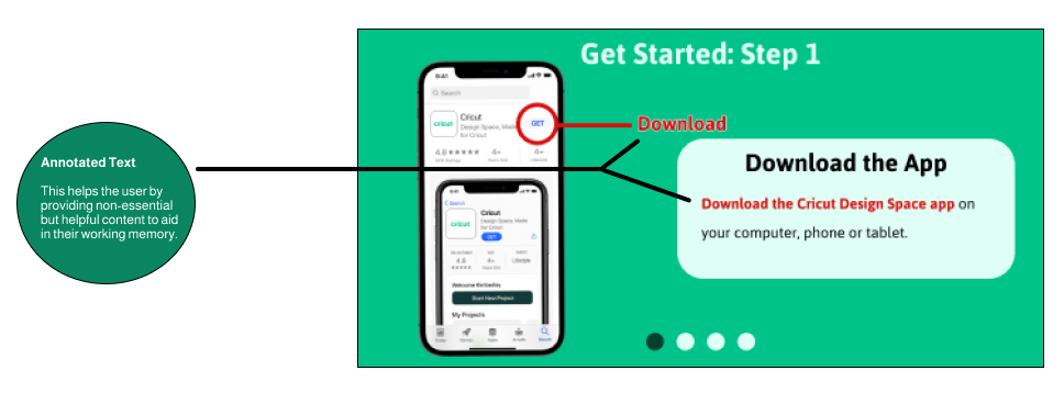
The Multimedia Principle states that people learn better through a combination of words and pictures rather than just words alone. I used this principle in the "How to Use" and the "Design Space" tutorials to demonstrate not only through words on how to use the product but by showing pictures that correlate to the directions. By also highlighting key text such as “Download” and “Download the Cricut Design Space app”, this helps with the users germane cognitive load - the mental effort to deal with non-essential but helpful information.
Jakob’s Law
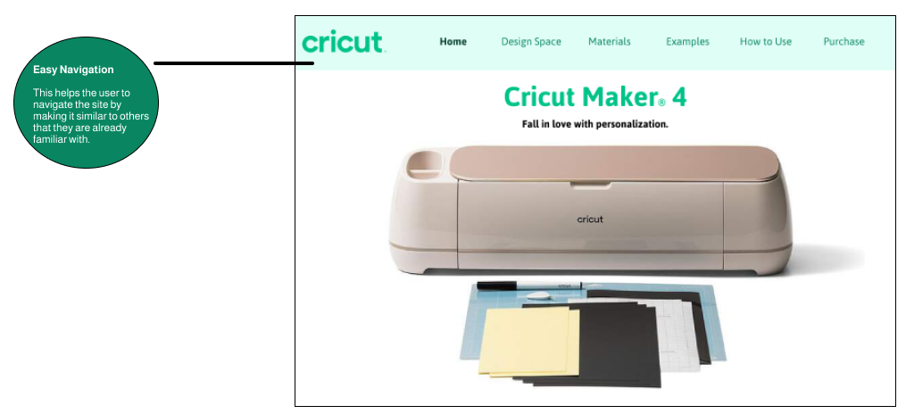
Jakob’s Law states that users prefer websites that work the same way as others that they are already familiar with. This is because the user's schema - their prior knowledge of how things work, and their understanding on how websites typically function, expects certain patterns. To keep the similarities with other sites consistent, the website includes clickable icons such as the “Cricut” logo in the top left of the screen to revert back to the “Home” page.
Final Prototype
For my final project in User Interface Design II, I designed a promotional website dedicated to learning about the Cricut Maker 4. The Cricut Maker 4 is Cricut’s newest model of their Maker cutting machine series. My prototype was broken down into sections specified for learning about what the Cricut does, about the Design Space app, qualifying cutting materials, examples of projects, tutorials, and a purchase page.
Retrospective
Through this project, I learned how to apply User Interface Design principles in a practical and meaningful way. I began to understand how design choices directly impact how users process and retain information. It taught me to think beyond aesthetics and focus on usability, structure, and user flow. This experience helped me see how clear hierarchy, consistent navigation, and interactive elements can create a smoother, more memorable experience.
Cricut Maker 4 Promotional Project
Project Proposal
Prototype
Role
User Interface Designer
Figma
Tools
Two Months
Work
Duration

